
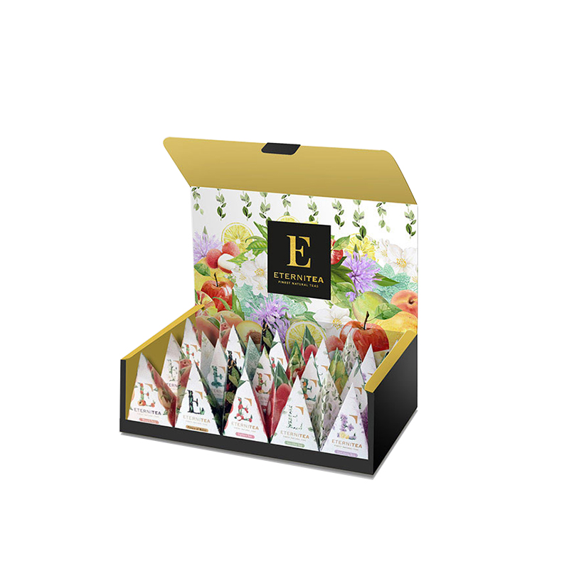

ETERNITEA
Category : Branding
Year : 2015
“Like a cup of tea, It’s all in how you make it.”
The ingredients and process, those are what matters. A good brand was born out of a story, insights, ideas and strategy.
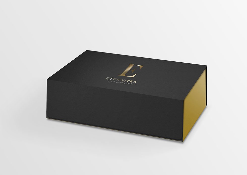
Eternitea is a premium tea product by Toffin. It’s difficult to stand out in a crowded market, yet Eternitea set us that very challenge. Eternitea had crafted some excellent and finest quality tea blends, but no brand identity to adorn them in. In addition Toffin, the mother company had been well established and familiar name in this industry. Thus, we create a logo and a way to communicate the products to visual.
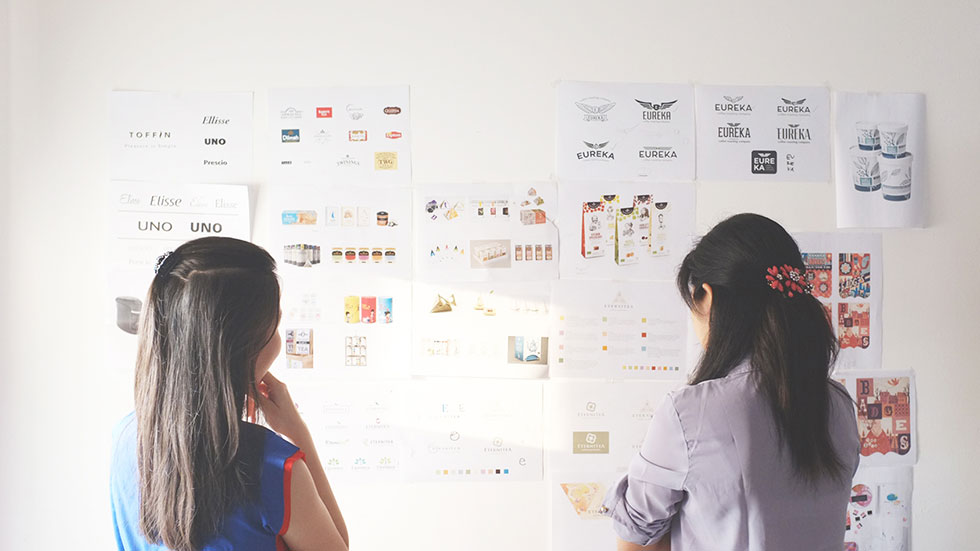
Logo Development
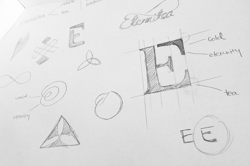


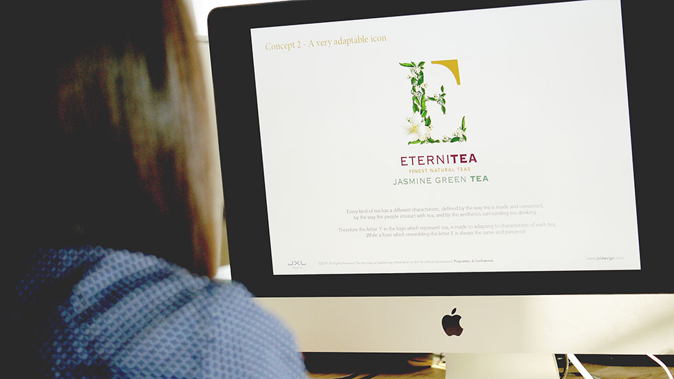

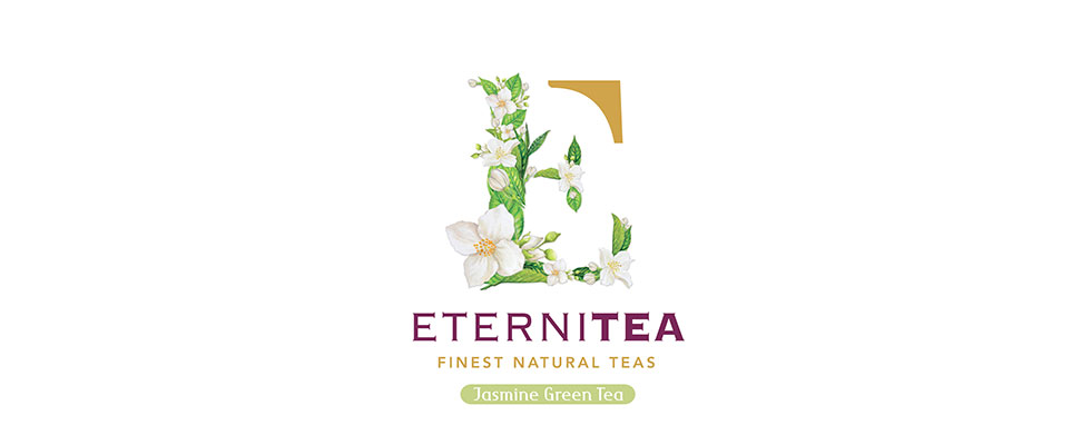
Logo Concept
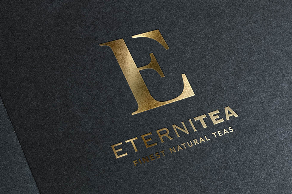
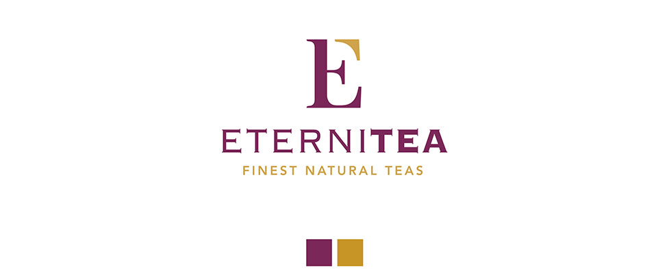
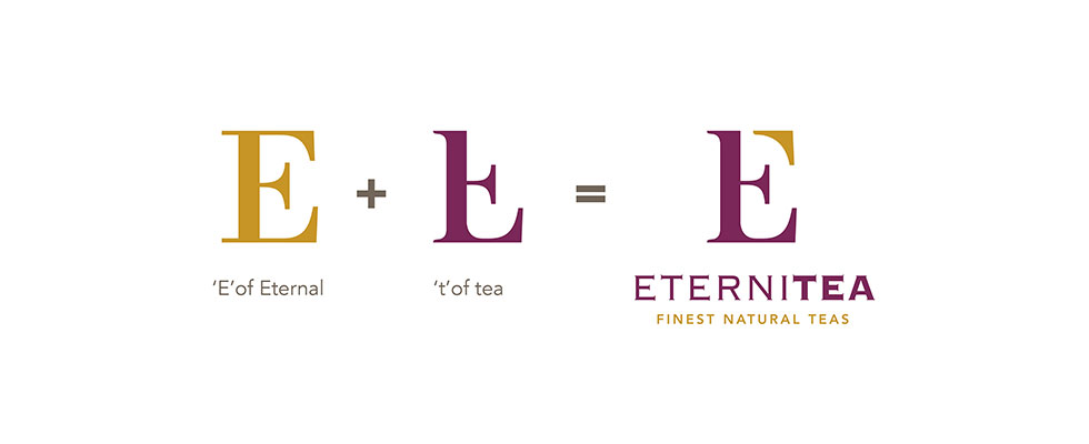
Eternitea = Eternal + Tea
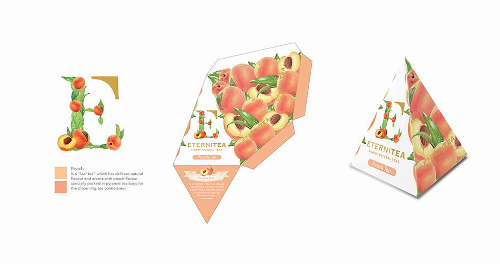
Tea is always symbolized as a liquid of gold, that gives tranquility, warmth and freshness. Gold is a symbol of eternity and perfection, as it represents the quality and exclusiveness of the product itself – an endless perfection.
The logo is symbolized the word Eternal and Tea by the form combined between letter ‘E’ and ‘t’.


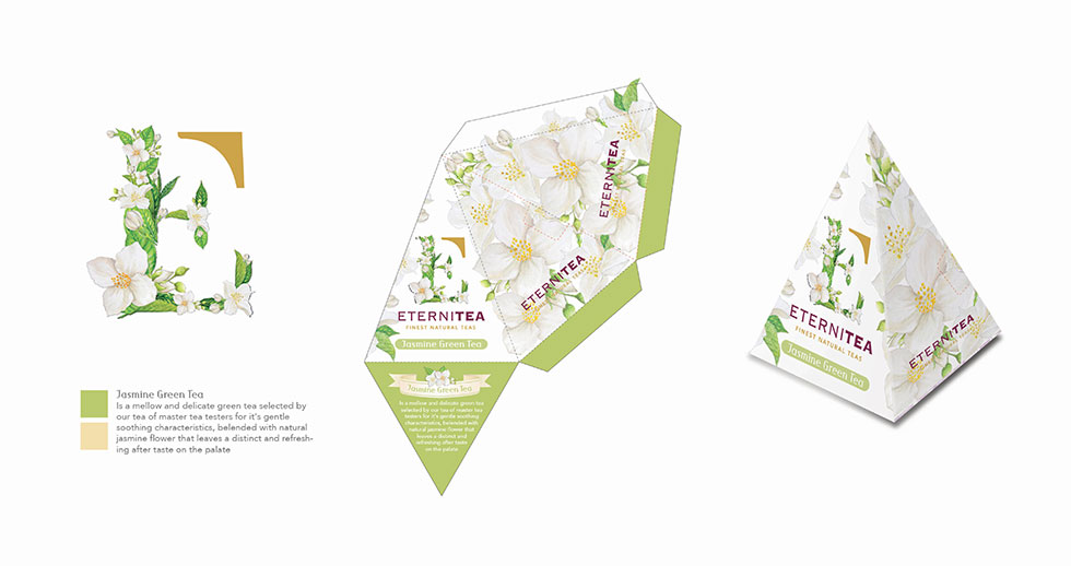
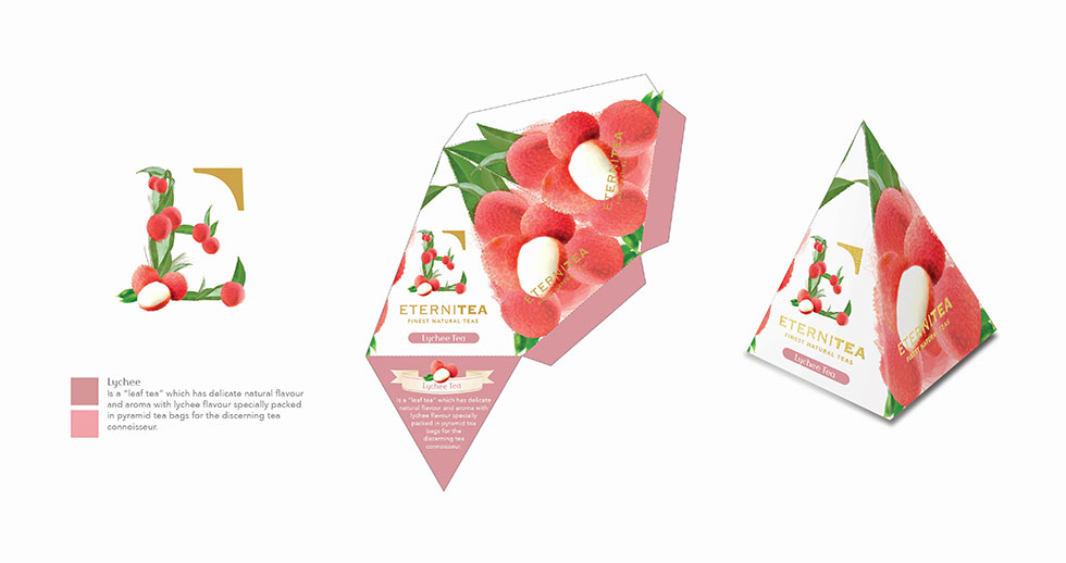
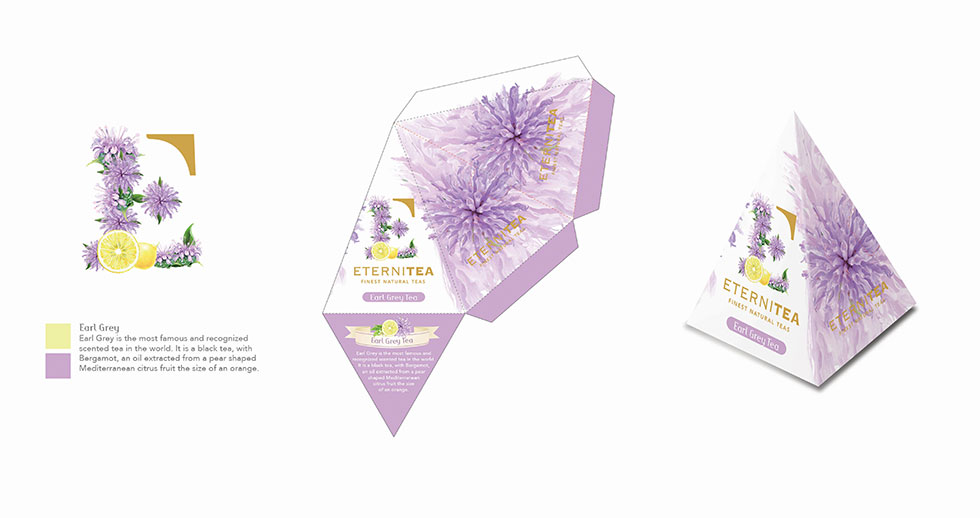
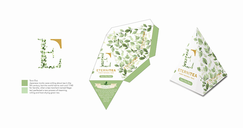
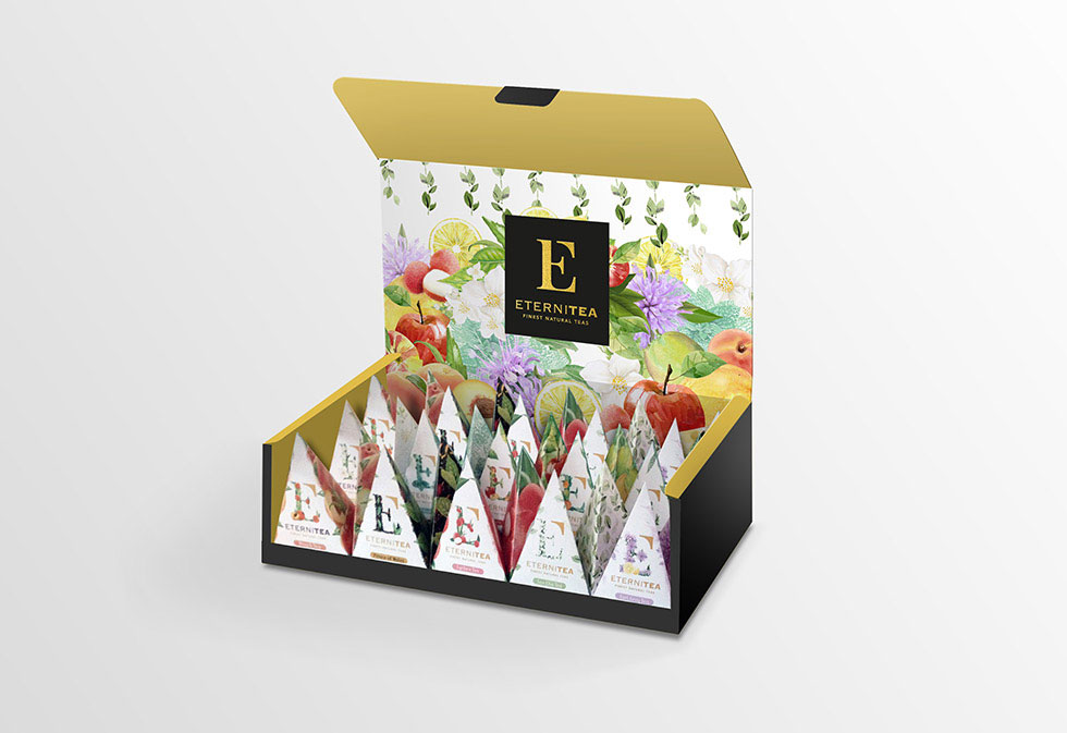
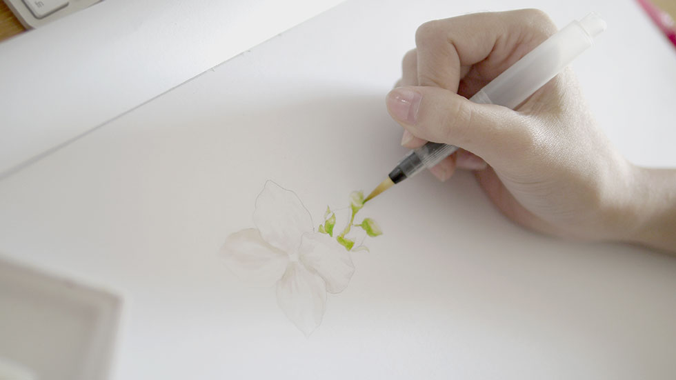
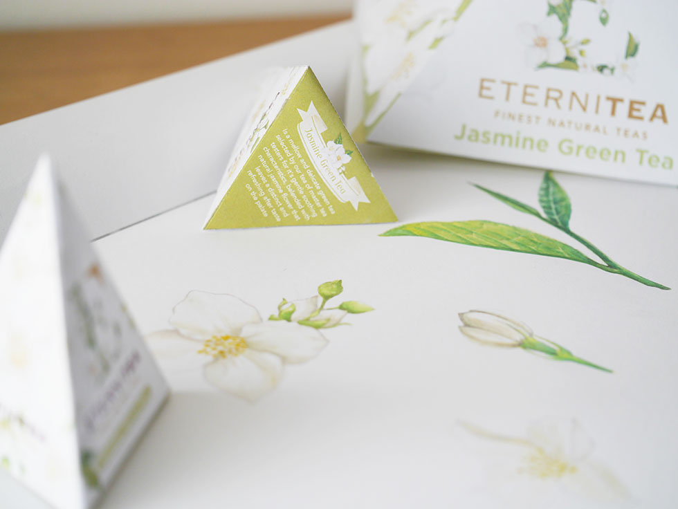
Packaging